Welcome to the second Astro JS Tutorial Series! After following the previous series, we now should have a solid understanding of the fundamentals of the Astro JS web framework. In this series, we will build up on the lessons we have learned previously and build a full-fledged Astro LinkTree Clone.
If this is your first time using Astro JS, we highly recommend going through the first tutorial series before starting with this one since we cover a lot of topics we are not going to explain again in great detail in this tutorial.
Table of Contents
- Astro LinkTree Clone Project
- Requirements
- Creating The Project
- Astro Import Aliases
- Folder Structure
- Global Styling
- Creating a Layout
- Setting the Layout
- Creating the Avatar Component
- Featured Cards
- LinkTree Links
- Social Links
- Deploying to Netlify
- Conclusion
Astro LinkTree Clone Project
This tutorial series is split into two parts.
Part 1 – Building the Foundation
In part 1, we will build a fully functional LinkTree clone using Astro and Tailwind CSS. Once we have built our application, we will deploy it on Netlify, and it’s ready to use. You can use this LinkTree clone for your own links and share it with your friends.
Part 2 – Integrating Netlify CMS
In part 2, we will add Netlify CMS to our LinkTree clone. That means we will be able to add, edit and delete links using Netlify CMS. This sounds harder than it is, but we highly recommend going through the motions even if you don’t plan to use Netlify CMS.
Completing part 2 will greatly enhance your knowledge of the Astro JS web framework!
You can clone the finished project from GitHub. Make sure to checkout the part-1 branch!
Requirements
To be able to follow along with this series, we recommend the following:
- The latest version of Node.js installed on your system.
- VSCode as your code editor.
- The official Astro JS extension installed in VS Code.
- The official Tailwind CSS extension installed in VS Code.
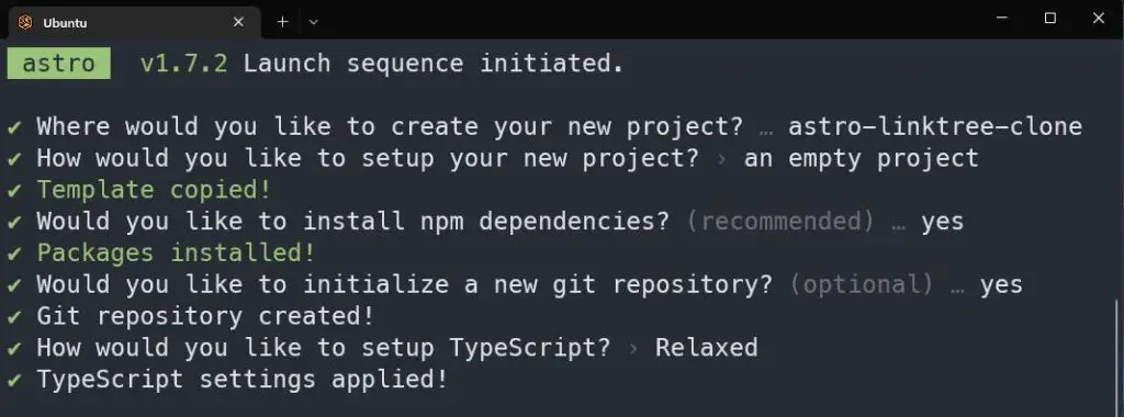
npm create astro@latest
npx astro add tailwind
npm i astro-icon
Code language: Bash (bash)
Creating The Project
To get started, create a fresh Astro project:
npm create astro@latest
Code language: Bash (bash)
In the prompts that follow, make your choices as in the image below. We name our project astro-linktree-clone:
Next, switch to your project directory:
cd astro-linktree-clone
Code language: Bash (bash)
Installing Tailwind CSS
We are going to use Tailwind CSS for our project; therefore, we need to install the official Astro Tailwind Package. Leave everything during setup on default:
npx astro add tailwind
Code language: Bash (bash)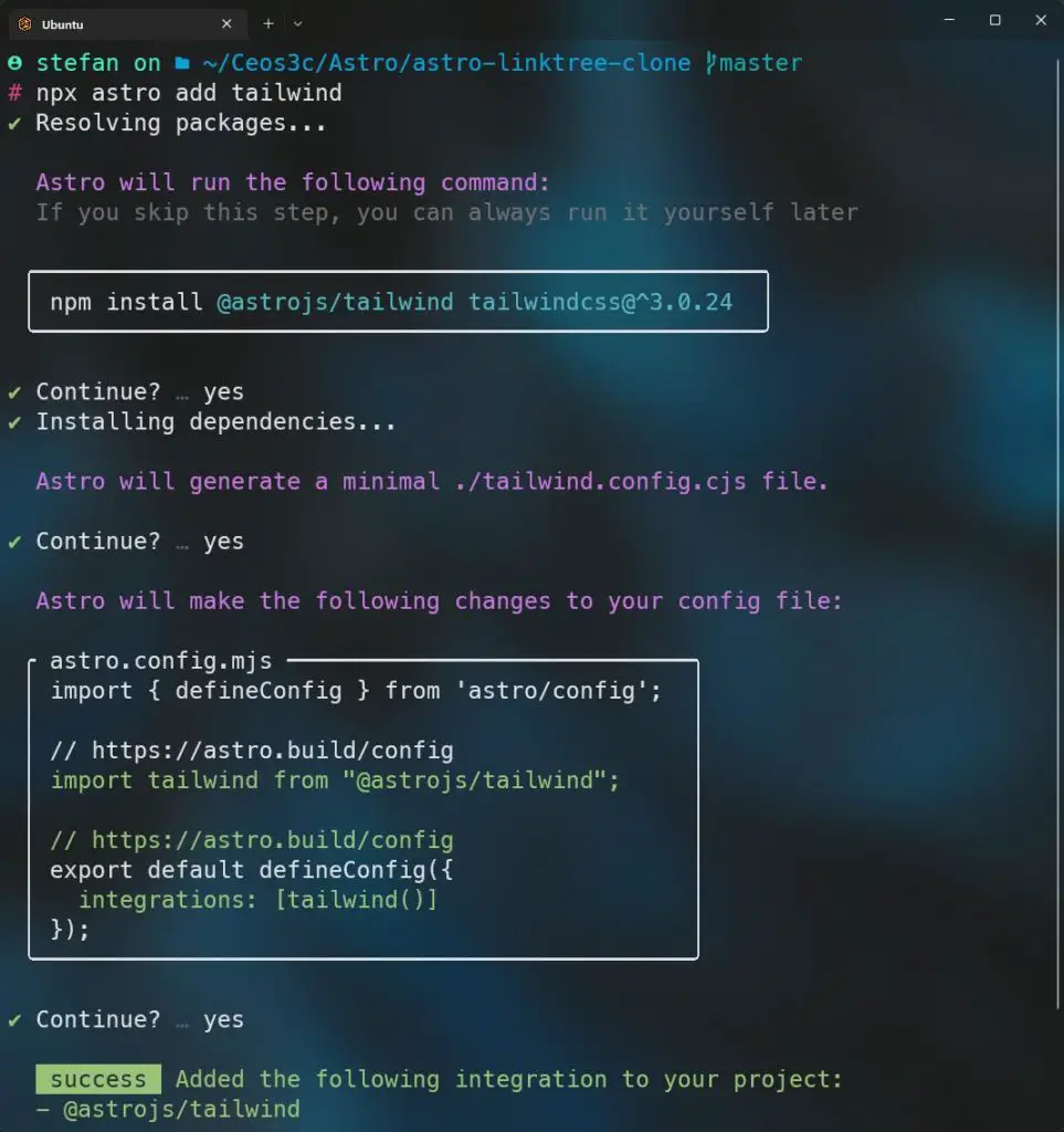
Installing Astro-Icon
We are going to use the astro-icon library for our social media icons and some other things, it is easily installed like this:
npm i astro-icon
Code language: Bash (bash)
Astro Import Aliases
Now that we have everything installed open your project in VS Code.
TIP: If you are using WSL 2, you can open VS Code by typing code . from inside of your project folder!
First, we are going to add some Astro Import Aliases. Import Aliases are a useful way to stay on top of your paths when importing from different folders.
Open your src/tsconfig.json file. Add the following code to it:
{
  "extends": "astro/tsconfigs/base",
  "compilerOptions": {
    "baseUrl": ".",
    "paths": {
      "@components/*": ["src/components/*"],
      "@assets/*": ["src/assets/*"],
      "@layouts/*": ["src/layouts/*"],
      "@pages/*": ["src/pages/*"],
      "@public/*": ["public/*"],
      "@styles/*": ["src/styles/*"],
    }
  }
}
Code language: TypeScript (typescript)
From now on, we are able to import anything by using the @alias syntax instead of typing the entire path like ../../components/Component.astro
Let’s say we want to import the MainLayout.astro file into our index.astro file. The classic way of doing it would be:
import MainLayout from "./layouts/MainLayout.astro"
Code language: JavaScript (javascript)
Instead, with Aliases, we can now do this:
import MainLayout from "@layouts/MainLayout.astro"
Code language: JavaScript (javascript)
Even you are down a few levels of folders, Astro will automatically figure out the correct path thanks to using Aliases. More on this in the video.
Folder Structure
Before we get started with writing some code, let’s make sure that we have the correct folders in place. Inside of your src folder, create the following folders:
- components
- layouts
- styles
Global Styling
Create a file called src/styles/global.css and add the following code to it:
@tailwind base;
@tailwind components;
@tailwind utilities;

a {
  color: inherit;
  text-decoration: none;
}

* {
  box-sizing: border-box;
  padding: 0;
  margin: 0;
}

body {
  background: linear-gradient(-45deg, #eee152, #e73cbc, #237cd5, #23bdd5);
  background-size: 400% 400%;
  animation: gradient 15s ease infinite;
}

@keyframes gradient {
  0% {
    background-position: 0% 50%;
  }
  50% {
    background-position: 100% 50%;
  }
  100% {
    background-position: 0% 50%;
  }
}
Code language: CSS (css)
In this global.css file, we define our background color, which is a gradient that automatically changes colors. We also adjust some basic styling like box model, margins, padding and link color.
Creating a Layout
Next, we create a global layout for our app. Create a file called src/layouts/MainLayout.astro and add the following code:
---
import "@styles/global.css"
const { title } = Astro.props
---

<html lang='en'>
  <head>
    <meta charset='utf-8' />
    <link rel='icon' type='image/svg+xml' href='/favicon.svg' />
    <meta name='viewport' content='width=device-width' />
    <meta name='generator' content={Astro.generator} />
    <title>{title}</title>
  </head>
  <body>
    <div class='flex flex-col items-center w-full'>
      <div
        class='flex flex-col items-center w-4/6 h-full my-20 lg:w-3/6 2xl:w-2/6 gap-y-14'
      >
        <slot />
      </div>
    </div>
  </body>
</html>
Code language: JavaScript (javascript)
In here, we do the following:
- We import our
global.cssfile. - We create a
titleprop to use throughout our app. - We set meta tags inside of our
<head>element. - We create a
<body>element and some<div>elements with some basic Tailwind styling that sets the layout for our app. - We add a Astro <slot> to our layout
Setting the Layout
Open your src/pages/index.astro file and replace everything that is inside with this code:
---
import MainLayout from "@layouts/MainLayout.astro"

---

<MainLayout title='Astro LinkTree Clone'>

</MainLayout>
Code language: JavaScript (javascript)
From now on, everything inside of our index.astro file will be wrapped in our layout. We also set the title prop to our page title.
Creating the Avatar Component
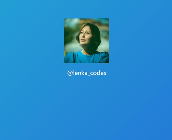
Either use your own image (I recommend a 1:1 ratio) or use this placeholder image from Unsplash:
Save the file at public/avatar.jpg.
Next, create the src/components/Avatar.astro file and open it. Add the following code to it:
<div class='text-center'>
  <img
    class='mb-4 rounded h-36 lg:h-56'
    src='/avatar.jpg'
    alt='Extra large avatar'
  />
  <a
    href='https://www.twitter.com/@'
    class='text-xl text-white transition-all duration-500 lg:text-2xl hover:text-teal-200'
    >@lenka_codes</a
  >
</div>
Code language: HTML, XML (xml)
Here we just create a simple avatar image with a link to our Twitter account and our handle.
Open the src/pages/index.astro file and add the following code to it:
---
import MainLayout from "@layouts/MainLayout.astro"
import Avatar from "@components/Avatar.astro"
---
<MainLayout title='Astro LinkTree Clone'>
<Avatar />
</MainLayout>
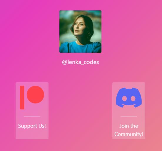
Code language: JavaScript (javascript)If you run your dev server and look at the page, you should see something like this:
You will also notice the automatically changing background color. We just added the first piece of our LinkTree clone to our empty page.
Featured Cards
Now we want to add some featured cards to our app. These are not the links in we use for the actual LinkTree, but just two featured cards on top of our app where we can link to important things like Patreon or other support channels.
These cards are optional, of course, you can always decide to not include them. First, we need to create another layout for our featured cards. This is sometimes necessary when working with nested flexbox components.
Create a file src/layouts/FeaturedCardsLayout.astro and add the following code to it:
<div class='flex justify-around w-full'>
  <slot />
</div>
Code language: HTML, XML (xml)
Then create the src/components/FeaturedCard.astro component and add the following code to it:
---
import { Icon } from "astro-icon"
const { featuredCardIcon, featuredCardTitle, featuredCardLink } = Astro.props
---

<div
  class='flex flex-col p-1 text-center transition-all duration-500 bg-white rounded lg:w-32 w-28 bg-opacity-20 backdrop-filter backdrop-blur-lg hover:bg-opacity-40 hover:scale-110'
>
  <a class='text-xs text-white sm:text-base' href={featuredCardLink}>
    <div class='flex justify-center'>
      <Icon class='h-24 p-2' name={featuredCardIcon} />
    </div>
    <div class='flex flex-col break-words'>
      <hr class='h-px mx-6 my-4 bg-white border-0 opacity-50' />

      <p class='text-sm text-white sm:text-lg'>{featuredCardTitle}</p>
    </div>
  </a>
</div>
Code language: JavaScript (javascript)
In here, we do a bunch of things:
- We import
astro-icon. - We create a couple of props so we are able to dynamically adjust some properties of our featured cards such as the icon, the title and the link.
- We add some styling to our featured cards.
Now back to src/pages/index.astro. Add the following code:
---
import MainLayout from "@layouts/MainLayout.astro"
import Avatar from "@components/Avatar.astro"
import FeaturedCardsLayout from "@layouts/FeaturedCardsLayout.astro"
import FeaturedCard from "@components/FeaturedCard.astro"
---

<MainLayout title='Astro LinkTree Clone'>
  <Avatar />
  <FeaturedCardsLayout>
    <FeaturedCard
      featuredCardIcon='logos:patreon'
      featuredCardTitle='Support Us!'
      featuredCardLink='https://www.patreon.com/stefanrows'
    />
    <FeaturedCard
      featuredCardIcon='logos:discord-icon'
      featuredCardTitle='Join the Community!'
      featuredCardLink='https://www.discord.com'
    />
  </FeaturedCardsLayout>
</MainLayout>
Code language: JavaScript (javascript)
Here we do the following:
- We import the
FeaturedCardsLayoutand theFeaturedCardcomponent. - We wrap our
FeaturedCardcomponent inside of theFeaturedCardsLayoutlayout. - We add some props to our
FeaturedCardcomponent.
As you can see, we use icons from astro-icons. These icons can be found here in case you want to use different ones.
If we look at the page now, we should see our new featured cards show up:
LinkTree Links
Now it’s time to add our LinkTree style links. For this, we create another Layout as well as a Link component.
Create the src/layouts/LinksLayout.astro file and add the following code to it:
<div class='flex flex-col items-center justify-center w-full gap-y-6'>
  <slot />
</div>
Code language: HTML, XML (xml)
Then create the src/components/Link.astro file and add the following code to it:
---
const { linkTitle, linkDescription, linkUrl } = Astro.props
---

<div class='flex flex-col items-center w-full gap-y-8'>
  <div
    class='flex flex-col justify-center cursor-pointer w-full p-4 text-sm text-center text-white transition-all duration-500 bg-white bg-opacity-20 backdrop-filter backdrop-blur-lg rounded-xl lg:text-xl hover:bg-opacity-40 hover:scale-110'
  >
    <a href={linkUrl}
      ><button
        ><span class='font-semibold'>{linkTitle}{" "}</span>{
          linkDescription
        }</button
      >
    </a>
  </div>
</div>
Code language: JavaScript (javascript)
Here, we do the same as in the FeaturedCard component. We add some styling and add some props so we are able to dynamically create new links in our src/pages/index.astro file.
Open the src/pages/index.astro file and add the following code:
---
import MainLayout from "@layouts/MainLayout.astro"
import Avatar from "@components/Avatar.astro"
import FeaturedCardsLayout from "@layouts/FeaturedCardsLayout.astro"
import FeaturedCard from "@components/FeaturedCard.astro"
import LinksLayout from "@layouts/LinksLayout.astro"
import Link from "@components/Link.astro"
---
<MainLayout title='Astro LinkTree Clone'>
<Avatar />
<FeaturedCardsLayout>
<FeaturedCard
featuredCardIcon='logos:patreon'
featuredCardTitle='Support Us!'
featuredCardLink='https://www.patreon.com/stefanrows'
/>
<FeaturedCard
featuredCardIcon='logos:discord-icon'
featuredCardTitle='Join the Community!'
featuredCardLink='https://www.discord.com'
/>
</FeaturedCardsLayout>
<LinksLayout>
<Link
linkTitle='🧑🚀 Astro'
linkDescription='Astro Homepage'
linkUrl='https://www.astro.build'
/>
<Link
linkTitle='🌍 My Portfolio'
linkDescription='Look at my portfolio!'
linkUrl='https://www.stefanrows.com'
/>
<Link
linkTitle='🎥 YouTube'
linkDescription='Visit my YouTube channel!'
linkUrl='https://www.youtube.com/c/stefanrows'
/>
</LinksLayout>
</MainLayout>
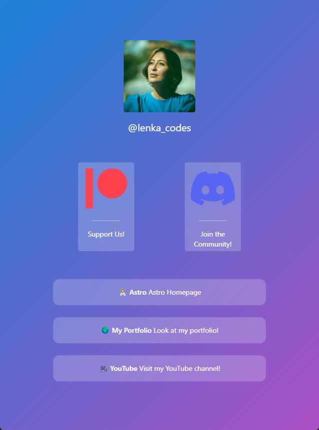
Code language: JavaScript (javascript)You are now able to create new links by creating a new <Link> tag and add the respective props to it. Our app now looks like this:
Social Links
To make things look a little better and add some more functionality to our app, let’s add some social links at the bottom.
Create a file src/components/Social.astro and add the following code to it:
---
import { Icon } from "astro-icon"
---

<div class='flex justify-between w-5/6 mt-20 text-teal-300'>
  <a
    class='transition-all duration-500 hover:scale-105 opacity-70 hover:opacity-100'
    href='https://www.twitter.com/@stefanrows'
  >
    <Icon class='w-8 md:w-12 xl:w-14' name='mdi:twitter' />
  </a>
  <a
    class='transition-all duration-500 hover:scale-105 opacity-70 hover:opacity-100'
    href='https://www.github.com/stefanrows'
  >
    <Icon class='w-8 md:w-12 xl:w-14' name='mdi:github' />
  </a>
  <a
    class='transition-all duration-500 hover:scale-105 opacity-70 hover:opacity-100'
    href='https://www.linkedin.com/stefanrows'
  >
    <Icon class='w-8 md:w-12 xl:w-14' name='mdi:linkedin' />
  </a>
  <a
    class='transition-all duration-500 hover:scale-105 opacity-70 hover:opacity-100'
    href='https://www.instagram.com/stefanrows'
  >
    <Icon class='w-8 md:w-12 xl:w-14' name='mdi:instagram' />
  </a>
  <a
    class='transition-all duration-500 hover:scale-105 opacity-70 hover:opacity-100'
    href='https://www.youtube.com/stefanrows'
  >
    <Icon class='w-8 md:w-12 xl:w-14' name='mdi:youtube' />
  </a>
</div>
Code language: JavaScript (javascript)
Here we import the astro-icon library once again, and we add some social links and a bit of styling.
Now open src/pages/index.astro and import the Social component:
---
import MainLayout from "@layouts/MainLayout.astro"
import Avatar from "@components/Avatar.astro"
import FeaturedCardsLayout from "@layouts/FeaturedCardsLayout.astro"
import FeaturedCard from "@components/FeaturedCard.astro"
import LinksLayout from "@layouts/LinksLayout.astro"
import Link from "@components/Link.astro"
**import Social from "@components/Social.astro"**
---
<MainLayout title='Astro LinkTree Clone'>
<Avatar />
<FeaturedCardsLayout>
<FeaturedCard
featuredCardIcon='logos:patreon'
featuredCardTitle='Support Us!'
featuredCardLink='https://www.patreon.com/stefanrows'
/>
<FeaturedCard
featuredCardIcon='logos:discord-icon'
featuredCardTitle='Join the Community!'
featuredCardLink='https://www.discord.com'
/>
</FeaturedCardsLayout>
<LinksLayout>
<Link
linkTitle='🧑🚀 Astro'
linkDescription='Astro Homepage'
linkUrl='https://www.astro.build'
/>
<Link
linkTitle='🌍 My Portfolio'
linkDescription='Look at my portfolio!'
linkUrl='https://www.stefanrows.com'
/>
<Link
linkTitle='🎥 YouTube'
linkDescription='Visit my YouTube channel!'
linkUrl='https://www.youtube.com/c/stefanrows'
/>
</LinksLayout>
**<Social />**
</MainLayout>
Code language: JavaScript (javascript)If you refresh your app now, you should see the social icons appear at the bottom:

Deploying to Netlify
Now that we are finished building our application, it’s time to deploy the app to Netlify. Since we are going to use Netlify CMS in the next part of the series, we have to use the Netlify CLI method to deploy our application.
First, make sure you have created a free Netlify account. Then, follow the steps below. Also, if you want to deploy via GitHub as well, make sure you have pushed your app to GitHub first. I recommend doing this.
Note: You must have GitHub set up in your terminal for this to work.
Install Netlify CLI globally:
npm install netlify-cli -gCode language: Bash (bash)Next, log in to Netlify:
netlify loginCode language: Bash (bash)Then we have to install the Astro Netlify integration. Just confirm every dialogue by pressing enter; this will automatically add the necessary code to your astro.config.mjs file:
npx astro add netlifyCode language: Bash (bash)Then we are going to deploy our site:
- Run
netlify initand follow the instructions- Create & Configure a new site
- Select your team
- Give the site a name or leave blank
- Agree to all following prompts by pressing Enter, leaving them as default.
- Run
netlify buildto build your project. - Run
netlify deploy --prodto deploy your project.
Conclusion
Now you have your very own Astro LinkTree clone that you can share with your friends. Since this is just a very basic template, you can go ahead and modify it to your liking.
In the next part of this series, we will add some more functionality to our application by adding Netlify CMS, allowing us to add and remove links using the Netlify CMS GUI.