
I recently started using React Styled Components when developing in React. There is a huge advantage to using Styled Components. They allow you to create multiple reusable components within just one .jsx file.
When playing around with Styled Components, I quickly realized how easily I could reuse some of my components. So, what I normally do is, create a GitHub Repository called something like: react-components. Here I will simply store all of the components that I have created for a client or for a project for later use.
Why throw away something that looks nice when you can easily export the whole thing within just one file? I’ll quickly run you through the process I use. For this example, we will use a simple, freshly created React App.
Table of Contents
- What is a Styled Component in React?
- Why we use Styled Components in React?
- Creating a new React App
- Installing Styled Components
- Creating Folders & The Button Component
- Creating the Button Component
- React Styled Components Props
- Adding styles to an Imported Component
- Conclusion
What is a Styled Component in React?
React Styled Components is a React library for writing components that have styles. It lets you use React components, but with the benefits of CSS styles. React Styled Components makes it easy to style React components individually without creating huge CSS files.
With React Styled Components, you can style React components using JavaScript, making it easy to change styles dynamically. React Styled Components also makes it easy to share styles between React components. React Styled Components is a great way to style React components and is easy to learn for React developers.
Why we use Styled Components in React?
One of the React community’s most popular libraries is React Styled Components, which allows developers to write CSS inline with their React components. There are many benefits to using React Styled Components over traditional CSS stylesheets.
Inline styling with React Styled Components can reduce the size of your codebase, as you don’t need to include separate CSS files. In addition, React Styled Components can make your code more maintainable and easier to read, as well as improve the performance of your application. Overall, React Styled Components provides a simpler and more efficient way to style React components and is widely used by experienced React developers.
- Allows developers to write Inline-CSS inside of their components.
- Reduces the size of the codebase.
- They make code more maintainable and easier to read.
- They provide a more efficient way to style React components.
Creating a new React App
You can skip this step if you don’t want to follow along and you just want to know how to create a reusable component. I went ahead and created a new folder in my WSL2 Ubuntu 20.04 installation called: reusable-button-component.
Then, I cd into the newly created folder and run create-react-app to create a new app inside this folder. Then I open VSCode from within the folder:
mkdir reusable-button-component
cd reusable-button-component
npx create-react-app .
code .Code language: JavaScript (javascript)
Then I just launch the app with npm start. If you follow along you should see something like this now:
Installing Styled Components
Now we need to go ahead and also install the React Styled Components NPM package. To do that, simply type:
npm install styled-components --saveCode language: JavaScript (javascript)The --save syntax at the end is optional in case you want to include React Styled Components to your package.json file.
Don’t forget to run npm audit fix in case some vulnerabilities are detected.
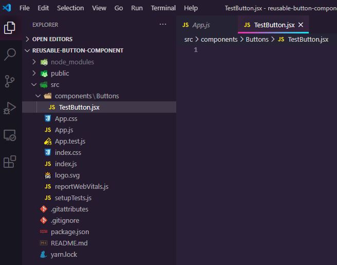
Creating Folders & The Button Component
Now that we have that in check, we can go ahead and create our components folder inside of the src folder.
Inside of the components folder, we create a Buttons folder.
Inside of the Buttons folder we create a file called TestButton.jsx
Your folder structure should now look something like this:
Creating the Button Component
Alright, time to create our button. We will do something very simple to not overcomplicate things.
First we need some React boilerplate:
import React from 'react'

export const TestButton = () => {
    return (
        <div>

        </div>
    )
}Code language: JavaScript (javascript)
You should be familiar with this.
Next up we need to import styled-components:
import React from 'react'
import styled from 'styled-components'

export const TestButton = () => {
    return (
        <div>

        </div>
    )
}Code language: JavaScript (javascript)
Good. Our foundation is set!
Next up, we create a React Styled Component called Button (or whatever you like) and apply some simple styling to it:
import React from 'react';
import styled from 'styled-components';

const Button = styled.button`
  background-color: green;
  width: 150px;
  height: 50px;
  border: none;
  border-radius: 10px;
  color: white;
  text-align: center;
  text-decoration: none;
  display: inline-block;
  font-size: 16px;
`;

export const TestButton = () => {
  return <div></div>;
};Code language: JavaScript (javascript)
This is the React Styled Components syntax. A bit weird if you have never used it before, but it makes sense once you do use it. It’s basically just CSS wrapped inside of backticks ` `.
Now we need to return our button in our TestButton function:
import React from 'react';
import styled from 'styled-components';

const Button = styled.button`
  background-color: green;
  width: 150px;
  height: 50px;
  border: none;
  border-radius: 10px;
  color: white;
  text-align: center;
  text-decoration: none;
  display: inline-block;
  font-size: 16px;
`;

export const TestButton = () => {
  return <Button></Button>;
};Code language: JavaScript (javascript)
And we can go ahead and import it to our App.js:
import logo from './logo.svg';
import './App.css';
import { TestButton } from './components/Buttons/TestButton.jsx';

function App() {
  return (
    <div className='App'>
      <header className='App-header'>
        <img src={logo} className='App-logo' alt='logo' />
        <TestButton>TEXT</TestButton>
      </header>
    </div>
  );
}

export default App;Code language: JavaScript (javascript)
I cleaned up the App.js file a bit and just left the React logo in there, importing our TestButton below.
I also went ahead and added some TEXT between our <TestButton>TEXT</TestButton>
What we now see is this:
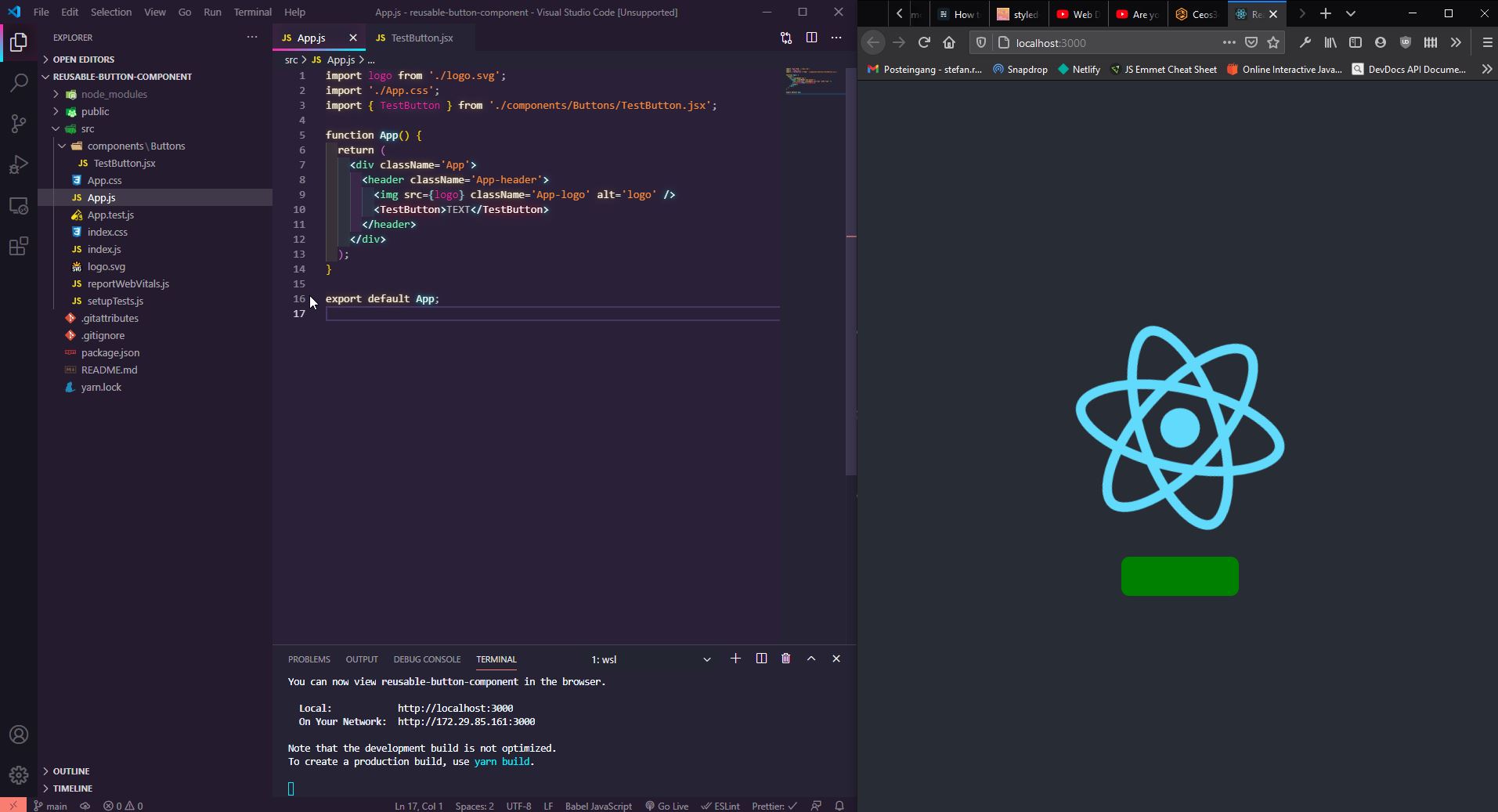
As you can see, we don’t have TEXT on our button. This is because we didn’t give our Button component a children prop yet.
React Styled Components Props
To be able to change or add some text after importing our TestButton component, we need to make sure to pass a children prop to our TestButton component.
So back to our TestButton.jsx file.
import React from 'react';
import styled from 'styled-components';

const Button = styled.button`
  background-color: green;
  width: 150px;
  height: 50px;
  border: none;
  border-radius: 10px;
  color: white;
  text-align: center;
  text-decoration: none;
  display: inline-block;
  font-size: 16px;
`;

export const TestButton = ({ children }) => {
  return <Button>{children}</Button>;
};Code language: JavaScript (javascript)
I went ahead and passed { children } as an argument to our TestButton function, as well as between our <Button>{children}</Button> HTML tags.
This allows us now to pass something (text) to the component after importing it.
If you click on save, you should already see TEXT popping up on our Button.
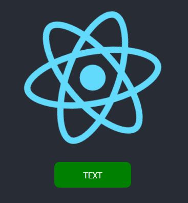
Now we basically have a fully functional, importable, re-usable component within our TestButton.jsx file that we can reuse wherever we want.
But lo’, you’re probably already thinking about it: But can I still add some style to the Button individually AFTER importing it?!
Yes, yes, of course, you can!
Adding styles to an Imported Component
That is fairly easy. The process is kind of similar to what we did with the children prop.
Back to our TestButton.jsx file.
Now, we need to pass another prop called className to our TestButton. First as a function argument next to children, and then once more inside of our <Button> HTML tag.
import React from 'react';
import styled from 'styled-components';

const Button = styled.button`
  background-color: green;
  width: 150px;
  height: 50px;
  border: none;
  border-radius: 10px;
  color: white;
  text-align: center;
  text-decoration: none;
  display: inline-block;
  font-size: 16px;
`;

export const TestButton = ({ children, className }) => {
  return <Button className={className}>{children}</Button>;
};Code language: JavaScript (javascript)
Now back in our App.js we need to create another React Styled Component, which inherits all styles from our TestButton Component, plus the styles you assign to it.
To be able to do that, you need to also import styled-components where ever you want to create this modified component, in our case, inside of our App.js file.
So make sure to have import styled from 'styled-components' at the top of your file:
import logo from './logo.svg';
import './App.css';
import { TestButton } from './components/Buttons/TestButton.jsx';
import styled from 'styled-components';

const ModifiedTestButton = styled(TestButton)`
  background-color: red;
  font-size: 2rem;
  font-weight: bold;
`;

function App() {
  return (
    <div className='App'>
      <header className='App-header'>
        <img src={logo} className='App-logo' alt='logo' />
        <ModifiedTestButton>TEXT</ModifiedTestButton>
      </header>
    </div>
  );
}

export default App;Code language: JavaScript (javascript)
First, you see that I created a new Component called ModifiedTestButton. I set this equal to styled(TestButton), which is the name of our original button.
Then I applied some styling to it. You can see that I have changed the background color from green to red, which means that everything that was inherited can be changed by merely changing the style without the need for something like !important.
Anything new you add to it will also be applied without changing your original Button component.
Also, note that I have changed the <TestButton> HTML Tags to <ModifiedTestButton>.
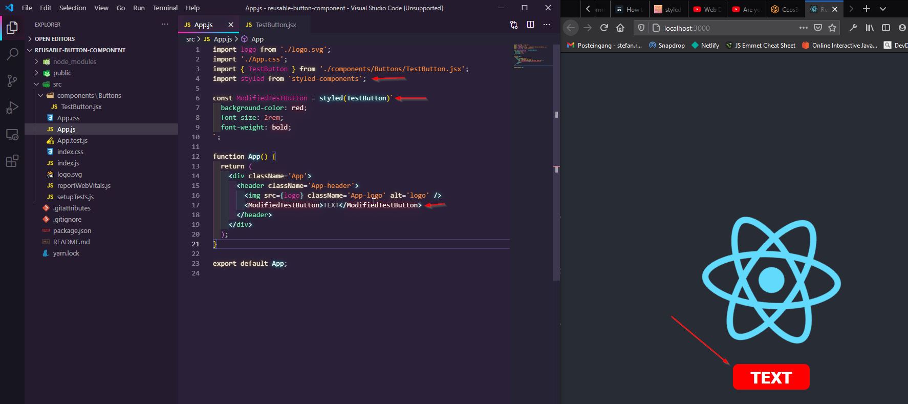
With all that in place, we have now modified our original TestButton with a unique style.
Conclusion
As you can probably see by now, React Styled Components are a really powerful tool.
I completely switched over from classic CSS files to React Styled Components whenever I can. It is so cool to be able to reuse your components once you have created them.
You can go ahead and just store this TestButton.jsx file inside of your own react-components repository, and you can go ahead and re-use it in different projects with ease.
I already have a couple of Navbars, Buttons, Footers, etc inside of my repository that I can easily re-use in client projects.
Happy Coding!
🧑💻 Learn Web Development
👉 Top Programming Languages in 2022
👉 The Fresh JavaScript Framework
🚀 NextJS
👉 NextJS and Tailwind CSS – Complete Beginner Guide
⚛️ React
👉 Build an Input Form with React Hooks
👉 React Styled Components – The Complete Guide